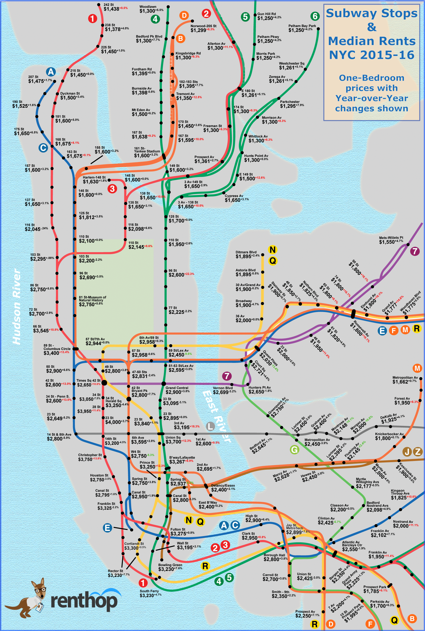
Check out our updated for 2017 NYC subway median rent map and study!
Close your eyes and think of your least favorite things about New York City. If the subway and your monthly rent come to mind, then you're in for a treat. The RentHop data science team has put together a map of median rents for one-bedroom apartments across all the subway lines. We cross-referenced our apartment listings to train entrance locations, taking the median of apartments within 500 meters or about two avenues from each stop. We set a minimum threshold of 50 listings for calculating each median, incrimentally expanding the radius around a subway stop if too few listings were returned. To prevent apartments that were listed multiple times, like open listings, from innacurately affecting the stats, we grouped duplicated listings.

It's no secret that the further you get from downtown, the lower the rent is. Many people would be unwilling to live outside the boundary of their preferred neighborhood, but what if you could save $500+ per month by travelling an extra stop on the train? The extra few blocks from 66th St to 72nd St could save you $845 per month. Granted you might really like the Lincoln Center area, but that's enough extra dough for a trip or two to the NY Philharmonic, the Met Opera, or even dinner at Jean-Georges.
A good rule of thumb is that each stop is about two minutes apart (except express stops and when crossing a bridge), assuming there's no "debris on the track" or "train traffic ahead". Consider this when calculating what your time and commute is worth to you. An extra stop on the J/M/Z train past Marcy Ave will save you about $175, and each subsequent stop saves another $100 or more. The same holds true heading into Queens.
Some neighborhoods are always hot and trending, and it is expected that rents will rise, but the prices here are just soaring. The top spots rose by 10-20% year-over-year, a large departure from the rate quoted by the Bureau of Labor Statistics' Consumer Price Index for New York - Northern New Jersey. The BLS published a year-over-year increase in ‘residential rents’ of 3.9% for the region, making these spots 3-5x more inflated than the rest of the region.
6 Train - 96th St & Lexington Ave - Upper East Side +22.3%
L/N/Q/R/6 Trains - 14th St & 3rd Ave - Union Square +18.3%
7/E/F/M/R Trains (TIE) 74th St, 90th St, Roosevelt Ave, Elmhurst Ave - Woodside +16.1%
1 Train - Christopher St - Greenwich Village +13.8%
1/A/B/C/D Trains - 59th St & 8th Ave - Columbus Circle +13.4%
A/C/E Trains (TIE) - 42nd St, 34th St & 8th Ave - Midtown West +13.0%
Not all prices are soaring - there are actually a few places where rent has come down over the past year. This is certainly not the norm though and has us wondering why. We believe the impending doom that is life without the L train may be the root cause of dropping prices along the line from Williamsburg to Bushwick. There could be other factors at play as well, inluding increased development and a greater number of brokers working these areas.
L Train - Morgan Ave - Bushwick -16.6%
L Train - Montrose Ave - East Williamsburg -14.1%
E/M/R Trains - Queens Plaza -Long Island City -13.4%
J/M Trains - Flushing Ave - Bedford Stuyvesant -12.4%
4/5/6 N/Q/R Trains - 59th St & Lexington Ave - Midtown East -9.6%
A/B/C/D/E/F/M trains - West 4th St / Washington Square - West Village -8.3%
In a city with such a diversity of people and choices there's no reason one should feel as though they don't have a choice. A little information goes a long way, and here at RentHop, we want to give you as much information and as many choices as you can handle. If you’re in the market for a new apartment, or were just influenced to move because of this study, be sure to check out our extensive selection of NYC apartments.
RentHop, it’s like apartment hunting.. but smarter.


