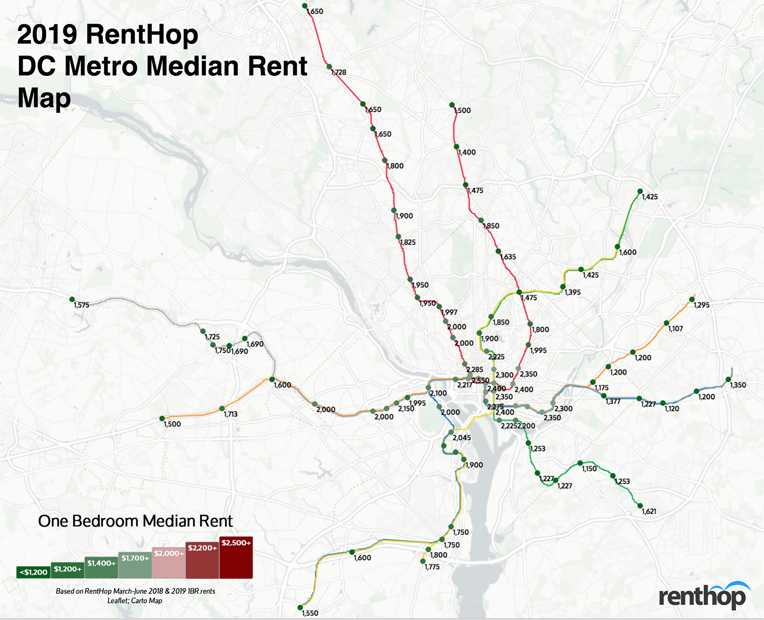
The Metro Rail system in the DC metropolitan area is the third busiest metro systems in the nation, serving nearly 750,000 riders living in the District of Columbia, as well as parts of Maryland and Virginia. The sprawling Metrorail transit system provides a backbone for the metropolitan area while stimulating business and real estate development. It is no wonder Metro proximity is one of the first things renters consider when looking for an apartment. It is almost always the case that the closer you are to a metro stop, the more expensive your apartment is. There is, however, still ways to save on rent. In fact, you might be able to save hundreds by moving just a couple of stops away from the center core, as shown in our 2019 DC Metro Rent Map.
Some of our findings this year include:
- Overall, 1BR median rent in Washington D.C. went up 2.4% from 2018 to 2019.
- Rent increased at 65 stops, compared to 50 in 2018. 19 stops experienced rent drops (compared to 35 stops in 2018). Five stops saw no growth.
- As fewer units right by the stop were available between March and June, median rent went up 10.9% at Farragut North (Red), mostly driven up by 1745 N Street NW, a new high-end condo building with units for rent that’s less than 0.4 miles away from the stop.
Our Interactive DC Metrorail Map Shows Median Rent for all Metro Stops
To calculate the median rent for the map above, we used RentHop’s rental data for one-bedroom apartments from March through June 2018 & 2019 as well as WMATA GIS data for Metrorail stops from DC.gov. To get accurate prices near the Metro stops, we looked first at non-duplicated listings within 0.62 miles of a WMATA stop and if there were 25 unique data points we calculated the median. If not, the radius from the stop was increased and the data was resampled to ensure enough unique listings were used when calculating the median.
Ride the Metro to Savings
The DC metro area saw year-over-year rent growth of 2.4% despite new rental deliveries and moderate absorption. Of all 91 stops, 65 stops experienced rent growth, compared to 50 in our 2018 study. Meanwhile, 1BR median rent dropped at 19 stops, 16 fewer than 2018. The rent drops are also more moderate compared to last year. Five stops experienced no change in rental rates.
These stops saw some of the biggest rent drops on one-bedroom apartments
- Rhode Island Ave – Red Line – $1,995, YoY -7.2%
- Addison Rd – Blue and Silver Lines – $1,120, YoY -6.7%
- Twinbrook – Red Line – $1,650, YoY -6.0%
- Gallery Place – Green, Red, and Yellow Lines – $2,350, YoY -4.1%
- Morgan Blvd – Blue and Silver Lines – $1,200, YoY -4.0%
- Waterfront – Green Line – $2,225, YoY -3.3%
These stops saw some of the biggest rent hikes on one-bedroom apartments
- Farragut North – Red Line – $2,550, YoY +10.9%
- Benning Rd – Blue and Silver Lines – $1,377, YoY +8.4%
- Southern Ave – Green Line – $1,227, YoY +7.9%
- Arlington Cemetery – Blue Line – $2,000, YoY +7.8%
- Dupont Circle – Red Line – $2,285, YoY +7.5%
- Minnesota Ave – Orange Line – $1,175, YoY +6.8%
However, one-bedroom median rents are still over $2,400 at many stops, specifically in and around the center core. To help you save on rent, we dug deep into the data and found some of the best single stop rent savings this year. You can, in fact, save a few hundred dollars by traveling an extra stop. The list below represents some of the largest rent drops between a single stop. Sometimes, this is because the stops are in different neighborhoods, rents fell at one stop, prices soared at the other, or all of the above. It’s also possible that apartments near a particular stop aren’t apples-to-apples with the apartments just one stop away. We may have left some out due to miles long stretches between stops.
Save on Rent by Adding a Little Time to Your Daily Metro Commute
- Save $1,125 between Stadium-Armory ($2,300) and Minnesota Ave ($1,175) – Orange Line
- Save $947 between Navy Yard-Ball Park ($2,200) and Anacostia ($1,253) – Green Line
- Save $923 between Stadium-Armory ($2,300) and Benning Rd ($1,377) – Blue and Silver Lines
- Save $400 between East Falls Church ($2,000) and West Falls Church ($1,600) – Orange Line
- Save $325 between U St ($2,225) and Columbia Heights ($1,900) – Green and Yellow Lines
Love our map? Here’s a condensed map for easy sharing –

What Does This Mean for You?
Finding an apartment is not easy – deciding where to live and starting your search is one of the most challenging parts of life. By giving you as much information about the market as possible, RentHop hopes to point you in the right direction. Maps like this are just one of the data-backed insights we offer. All of our Washington DC apartments for rent are ranked using available data to ensure that renters always see the best quality apartments.


