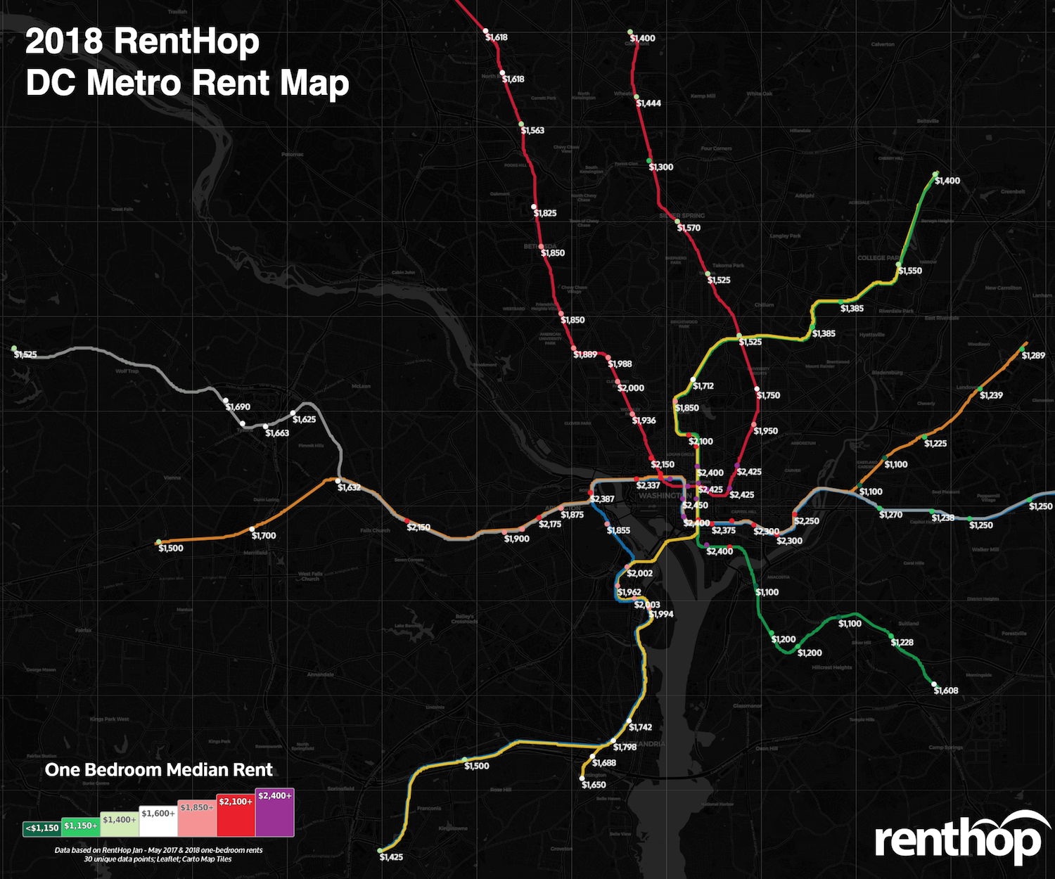
The Metro Rail system in the DC metropolitan area is the third busiest metro systems in the nation, serving nearly 750,000 riders living in the District of Columbia, as well as parts of Maryland and Virginia. The sprawling Metrorail transit system provides a backbone for the metropolitan area while stimulating business and real estate development. It is no wonder Metro proximity is one of the first things renters consider when looking for an apartment. It is almost always the case that the closer you are to a metro stop, the more expensive your apartment is. There is, however, still ways to save on rent. In fact, you might be able to save hundreds by moving just a couple of stops away from the center core, as shown in our 2018 DC Metro Rent Map.
Some of our findings this year include:
- Rent growth is slowing down in the DC metro area. Of all 91 stops, 35 stops experienced rent drops (compared to 19 stops in 2017), 50 stops experienced rent growth, and six stops saw no growth.
- More than half of the stops in Washington DC experienced rent drop, such as Eastern Market ($2,300, YoY -5.2%), Navy Yard-Ball Park ($2,200, -4.3%), and Judiciary Sq ($2,400, -3.4%).
- Rents continued to rise across Anacostia into southeast Washington, although the rents are still among the lowest in the DC metro area.
Our Interactive DC Metrorail Map Shows Median Rent for all Metro Stops
To calculate the median rent for the map above, we used RentHop’s rental data for one-bedroom apartments from January through May 2017 & 2018 as well as WMATA GIS data for Metrorail stops from DC.gov. To get accurate prices near the Metro stops, we looked first at non-duplicated listings within 0.62 mile of a WMATA stop and if there were 30 unique data points we calculated the median. If not, the radius from the stop was increased and the data was resampled to ensure enough unique listings were used when calculating the median.
Ride the Metro to Savings
The good news this year is that the train of rising rents is finally slowing down in the DC metro area (and major cities in the U.S. such as Boston and New York). With over 15,800 rental units pouring into the market in 2017, one-bedroom median rent only increased 0.41% in the DC metro area. Of all 91 stops, 35 stops experienced negative rent growth, compared to 19 stops last year. Many stops saw some rent growth, but all relatively moderate in comparison to last year.
These stops saw some of the biggest rent drops on one-bedroom apartments
- U St – Green and Yellow Lines – $2,100, YoY -8.7%
- Forest Glen – Red Line – $1,300, YoY -7.1%
- Court House – Orange and Silver Lines – $1,875, YoY -6.7%
- Pentagon – Blue and Yellow Lines – $2,002, YoY -5.8%
- Capitol South – Blue, Orange and Silver Lines – $2,350, YoY -5.8%
- L’Enfant Plaza – Blue, Green, Orange, Silver and Yellow Lines – $2,375, YoY -4.8%
These stops saw some of the biggest rent hikes on one-bedroom apartments
- Suitland – Green Line – $1,228, YoY +10.1%
- Ballston-MU – Orange and Silver Lines – $1,900, YoY +8.7%
- Potomac Ave – Blue, Orange and Silver Lines – $2,300, YoY +6.9%
- Greensboro – Silver Line – $1,698, YoY +6.3%
- Foggy Bottom-GWU – Blue, Orange and Silver Lines – $2,337, YoY +6.2%
- Cleveland Park – Red Line – $2,000, YoY +6.0%
However, one-bedroom median rents are still over $2,400 at many stops, specifically in and around the center core. To help you save on rent, we dug deep into the data and found some of the best single stop rent savings this year. You can, in fact, save a few hundred dollars by traveling an extra stop. The list below represents some of the largest rent drops between a single stop. Sometimes, this is because the stops are in different neighborhoods, rents fell at one stop, prices soared at the other, or all of the above. It’s also possible that apartments near a particular stop aren’t apples-to-apples with the apartments just one stop away. We may have left some out due to miles long stretches between stops.
Save on Rent by Adding a Little Time to Your Daily Metro Commute
- Save $1,100 between Navy Yard-Ball Park ($2,250) and Anacostia ($1,100) – Green Line
- Save $980 between Stadium-Armory ($2,250) and Benning Rd ($1,270) – Blue and Silver Lines
- Save $518 between East Falls Church ($2,150) and West Falls Church ($1,632) – Orange Line
- Save $512 between Rosslyn ($2,387) and Court House ($1,875) – Orange and Silver Lines
- Save $475 between Noma-Gallaudet U ($2,425) and Rhode Island Ave ($1,950) – Red Line
Love our map? Here’s a condensed map for easy sharing –

What Does This Mean for You?
Nearly 16,000 rentals were delivered in the DC metro area in 2017. The oversupply resulted in slow rent growth, which is perhaps the best news for renters in DC. However, it does not mean finding an apartment is easy – deciding where to live and starting your search is one of the most challenging parts of life. By giving you as much information about the market as possible, RentHop hopes to point you in the right direction. Maps like this are just one of the data-backed insights we offer. All of our Washington DC apartments for rent are ranked using available data to ensure that renters always see the best quality apartments.


