An Analysis of Rents and the Elevated Rail Lines
Close your eyes and think of your least favorite things. If the ‘L’ and your monthly rent comes to mind, then you’re in for a treat. The RentHop data science team has put together a map of median rents for one-bedroom apartments across the rail lines in Chicago. We cross-referenced our apartment listings to train entrance locations, taking the median of apartments within 500 meters. We set a minimum threshold of 50 listings for calculating each median, incrementally expanding the radius around a train stop if too few listings were initially returned. To prevent identical apartments that were listed multiple times, from inaccurately affecting the stats, we grouped duplicated listings.
Check out the map to see how rents are faring at your stop
Stops where rents dramatically dropped off are highlighted in Green.
Bright Green represents a 20%+ drop in price in just one subway stop.
Darker Green represents a 10-20% drop in price from the previous stop.
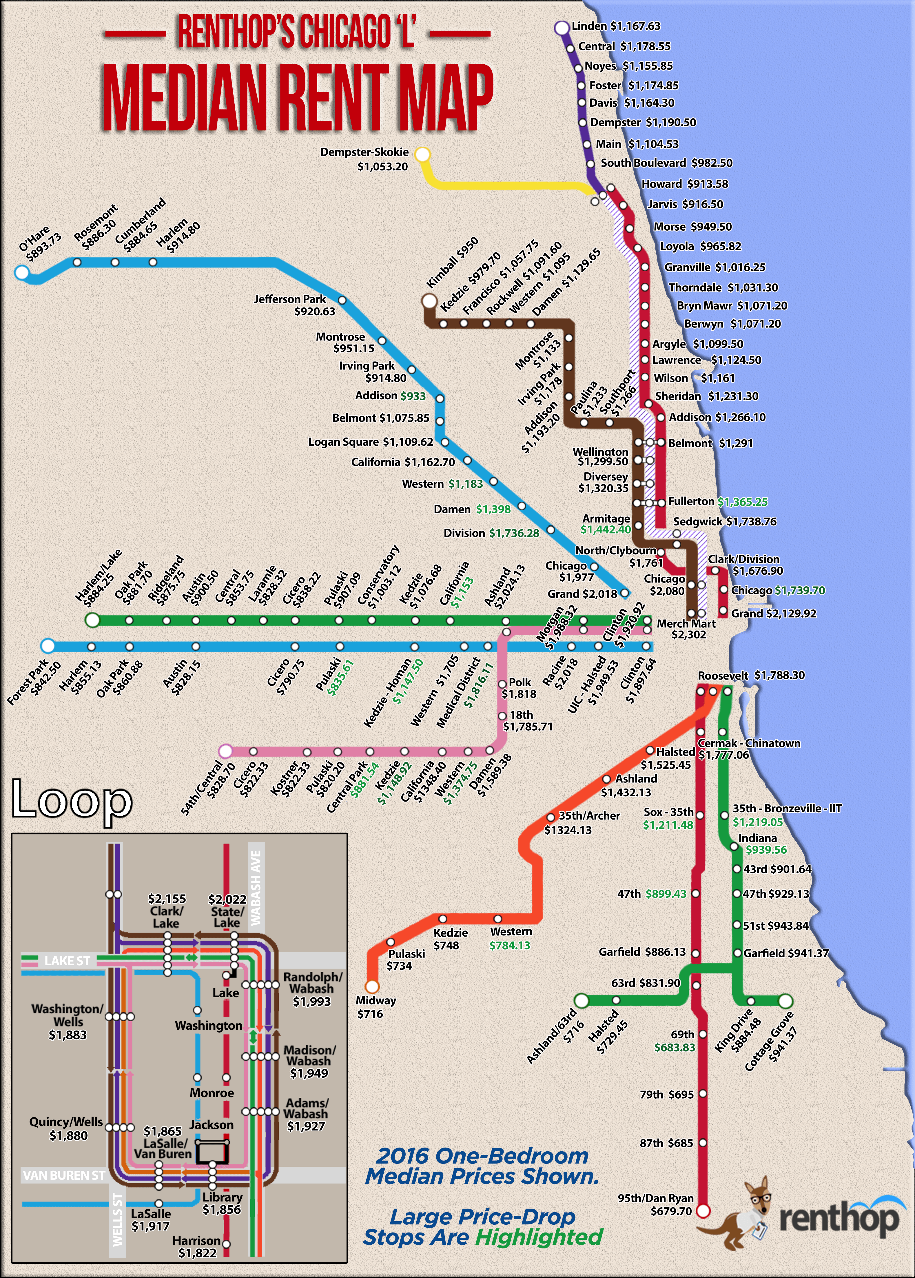
Would you commute for extra cash?
It’s no surprise that as you get farther away from Downtown Chicago, the more rents drop.
Often we’re forced to think about more than just location when choosing a neighborhood and prices are high. While looking at prices by L stop we found an interesting trend, in the range of 2-3 miles outside of the Loop in any direction, prices dramatically drop off. Although the purpose of the study was to inform readers of what rents are geographically, we also gained some insight into where certain affluence cut-off areas are. Without digging too deep into the reason behind the prices, it’s clear that some combination of commute time to the city center and gentrification plays a role in creating the price cliffs.
Let’s take a closer look at the prices and trends along the different ‘L’ lines.
Red Line
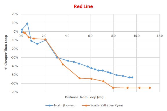
The Red line has the widest range of price of any subway line, reaching the furthest south and all the way north to Evanston. We see that prices jump a little heading north from the Loop, then drop steadily after that, with southbound trains having a steeper slope.
- Median monthly rent drops $390 between the Grand and Chicago stop on the Red Line, or 18.3%. That’s $4,680 a year saved by moving up just one subway stop
- The Chicago stop on the Red Line was $340 cheaper than around the Chicago stop on the Purple and Brown Line
- Moving to the Fullerton stop could save you $400/month, or 22.5% less than rent at North/Clybourn. That’s some serious savings for a few extra minutes of travel time in the morning
On the Red Line heading south rents drop off even more drastically
- From Cermak-Chinatown to Sox-35th there’s a $565 drop which is 31.8%
- In another 12 blocks (35th to 47th) rent drops another $310 or 25%
- Between 63rd and 69th we saw a 17.8% drop. Prices south of 69th were consistently low, the lowest of all prices along the subway lines of Chicago
Green Line
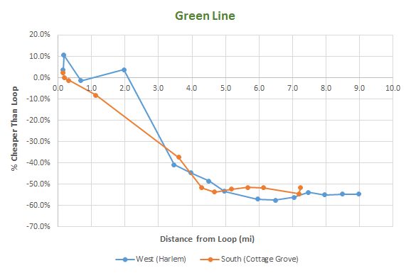
Chicago’s Green Line train reaches from the Loop to Harlem/Lake to the west, and Cottage Grove & Ashland/63rd to the South. It runs adjacent to the Red Line as well as the Pink and Blue lines for much of its length, and shares some similar price trends. The biggest price drop between any two stops occurs on the Green line.
- Making home near California on the Green Line will save a whopping $875 or 43% of monthly rent versus Ashland
- 35th Street-Bronzeville/IIT is 4% cheaper ($555) than the Cermak stop
- One can save $280 or 23% by living near the Indiana stop instead of IIT
Looking at our price-distance from the loop graph, we see that prices actually jump a few percent at 2 miles west of the Loop, then drops off sharply (past Ashland).
Blue Line
The Blue line train serves much of West Chicago as well as reaching all the way to O’Hare to bring visitors into the city. The city’s largest university, UIC, is served by the Blue line as well as the expansive and expanding Medical District, with clear effects being seen on the rent prices near those stops.
- The Medical District stop is a 10% or $200 savings over Racine
- Kedzie-Homan is $558 or an astounding 32.7% cheaper than Western Ave.
- Living near the Pulaski stop is worth $310/month, possibly worth considering, especially if you’re a student trying to keep expenses down.
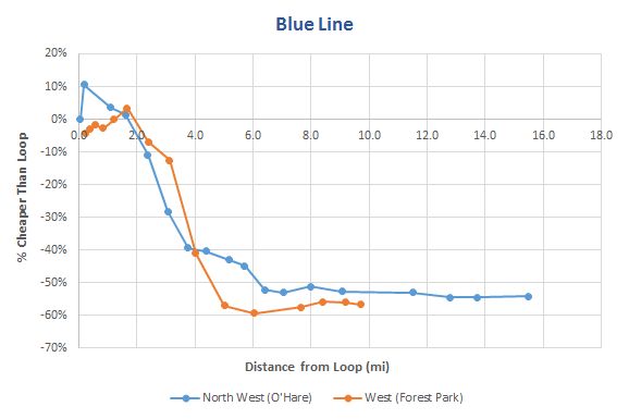
Heading Northwest on the Blue Line we see a price jump immediately outside the Loop, in River West. Continuing further will give you a series of very significant price drops.
- Commuting to the Division past the Chicago stop is worth $240 or a 12.1% monthly savings
- The Damen stop is 5% cheaper than Division, saving $340/month
- If you already live as far out from the Loop as Belmont, it may be seriously worth considering the move to Austin, where rent is 2% or $140 cheaper
Our price-distance graph shows rent prices decreasing at approximately the same rate when heading away from the Loop, with slight increases before the 2-mile mark, and very quick declines from 2-6 miles. Prices mostly flatten out after that.
Pink Line
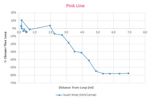
Chicago’s Pink Line train head west, adjacent to the Green Line, before turning south and west again. It’s a shorter line, but there’s still a few interesting data points with its rents as it heads west.
- Western Ave is 13.5% cheaper than Damen Ave, a $215/month savings
- Kedzie is a $200 drop (15%) from California
- Another stop on the Pink to Central Park is worth 23% of month’s rent or $260
Our price-distance graph shows that rents don’t start decreasing until 3 miles from the Loop. After that they decline steadily but swiftly.
Brown / Purple Lines
Our highest Median Rent was found around the Merchandise Mart at $2,302/month. Price decrease were much more gradual on these northbound-only lines. The only drastic price-drop was at the Armitage stop, where rent is $300 less than at Sedgwick, an 18% savings.
Orange Line
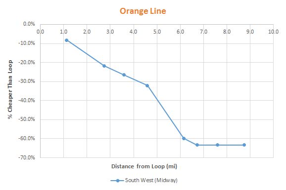
The Orange line train head southwest from the Loop to Midway Airport. There wasn’t an abundance of rentals in this region and the stops are pretty far apart. There is a big drop in prices between 35th and Western, $540 actually, but apartments are a bit scarce.
Don’t settle for less than you deserve
In a city with such a diversity of people and choices there’s no reason one should feel as though they don’t have a choice. A little information goes a long way, and here at RentHop, we want to give you as much information and as many choices as you can handle. When calculating where to live, think about how much your commute is worth to you. It may be hard to hold on to the perfect neighborhood when you can save $4,000-$5,000 a year by living 10 minutes further away. When it comes down to it, you’ll have to weigh the importance of location with how much you value your time.
If you’re in the market for a new apartment, or were just influenced to move because of this study, be sure to check out the extensive selection of Chicago apartments for rent.
RentHop, it’s like apartment hunting.. but smarter.


