Next Stop – Lower Rent Prices
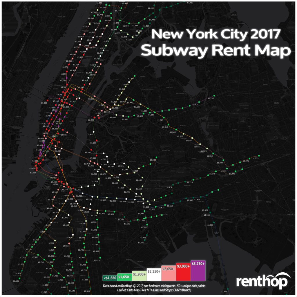
New York’s MTA subway system is an essential part of many New Yorkers’ lives. With as many as 5.7 million riders each weekday, it truly is the backbone of the city. It should be no surprise then, that it is one of the first things that people consider when looking to rent an apartment. Close proximity to the right trains means shorter commutes and more time spent doing what you love. RentHop’s data scientists love maps and rental data, so we’ve mapped out rental prices by subway stop to assist in your apartment hunting endeavors.
Major subway hubs like Union Square, Times Square, and Atlantic Ave/Barclay’s Center give nearby residents flexibility and convenience when traveling or commuting to different places. They also make it easy to get home from anywhere or to have people over. It’s no wonder strategically placed subways stops ranked among the most expensive stops on the RentHop subway rent map.
One Bedroom Rent Prices For Major NYC Subway Hubs
- Union Square 14th St (4,5,6,L,N,Q,R,W Trains) – $5,265 (+9.1% YoY)
- Times Square 42nd St (1,2,3,7,N,Q,R,S,W Trains) – $3,468 (-3.7% YoY)
- West 4th St (A,B,C,D,E,F,M Trains) – $3,395 (-15.1% YoY)
- Herald Square 34th St (B,D,F,M,N,Q,R,W Trains) – $3,350 (+3.1% YoY)
- Fulton St (A,C,J,Z,2,3,4,5 Trains) – $3,346 (-0.2% YoY)
- Atlantic Ave – Barclay’s Center (2,3,4,5,B,D,N,R,Q) – $3,040 (+13.4% YoY)
- Broadway Junction (A,C,J,L,Z) – $2,035 (+16.3% YoY)
The Interactive Map Below Shows All Rents, Stops, and YoY Price Fluctuations
In order to calculate the median rent for the map above, we used our RentHop rental data for one bedroom apartments from the first quarter of 2016 & 2017 and GIS data for subway stops compiled by CUNY – Baruch College. To get accurate prices near the subway stops, we looked first at non-duplicated listings within one eighth of a mile (660 feet) of a subway stop and if there were at least 50 unique data points we calculated the median. If not, the radius from the subway stop was increased and the data was resampled to ensure enough unique listings were used when calculating the median. Also check out the still map at the bottom for a quick snapshot of the data and easy sharing.
Where Does the Train of Rising Rents Stop?
This year, we’ve seen rents dropping across most of Manhattan Island while prices in the outer boroughs and Upper Manhattan rise due to what appears to be a migration in search of bigger apartments and/or cheaper rents. This spells good deals and eager landlords in some surprising places. Below, we’ve compiled a list of the stops with the largest price pops and drops since Quarter 1 2016.
These subway stops saw the biggest rent drops on one bedroom apartments
- 4/5/6 N/R/W Trains – 59th Street / Lexington Ave – (-15.5%) $3,250
- A/B/C/D/E/F/F Trains – W4 St – (-15.1%) $3,395
- 1/2/3 Trains – Chambers St – (-13%) $3,850
- (TIE) 6 Train – Astor Place – (-12.8%) $3,224
- (TIE) 6 Train – 28th St – (-12.8%) $4,185
- 1 Train – Christopher St / Sheridan Sq – (-12%) $3,650
These subway stops saw huge rent jumps
- Q Train – Parkside Ave – (+25.8%) $2,353
- J Train – Halsey St – (+24.7%) $2,245
- C Train – Ralph Ave – (+22%) $2,269
- J/Z Trains – Chauncey St – (+19.5%) $2,298
- L Train – Atlantic Ave – (+18.9%) $2,320
Time or Money?
Would you travel a few extra stops to save a couple hundred dollars? How about for $800? We scanned the map for the best single stop rent savings and found some really surprising results.
The list below represents the largest price disparities between a single stop. This could be because they are on the edge of a business development district, rents dropped at one stop, prices soared at the other, both, or all of the above. It’s also possible that the typical one bedroom apartment near one stop is very different from an apartment a stop away.
Turn your commute into extra cash at these stops
- Save $1,082 between 68th St ($3,595) and 77th St ($2,512) – 6 Train
- Save $823 between 116th St ($2,948) and 125th St ($2,125) – 1 Train
- Save $702 between 96th St ($3,100) and 103rd St ($2,398) – BC Trains
- Save $702 between Nassau Ave ($3,102) and Greenpoint Ave ($2,400) – G Train
- Save $625 between Astoria Blvd ($2,500) and Astoria Ditmars Blvd ($1,875) – NW Trains
There’s Also a Condensed Map for Easy Sharing

What Does This Mean For You?
Finding an apartment in New York City is hard. Deciding where to live and starting your search is probably the most difficult step. By giving you as much information about the market as possible, RentHop hopes to point you in the right direction. This map is just one of the data-backed insights we offer. All of our New York City apartment listings are ranked using available data to ensure that renters always see the best quality apartments.


