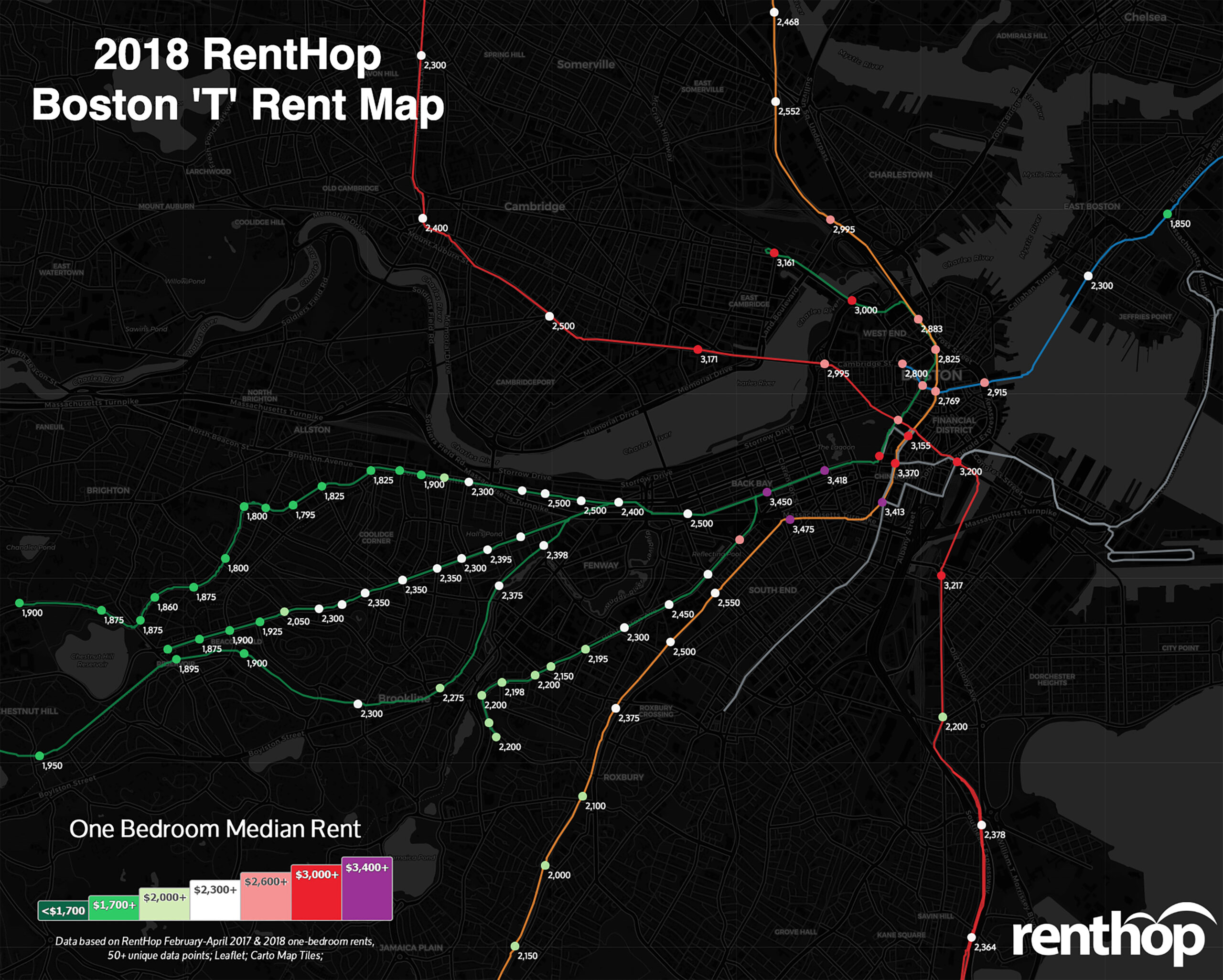
Boston’s T is one of the largest rapid transit systems in the nation, behind New York City and Chicago and similar in size to Washington D.C. This means hundreds of thousands of people rely on the MBTA system to get them to and from work, school, yoga classes, and whatever else they may need. It is no wonder proximity to the T is one of the first things people consider when searching for an apartment in Boston. As important as it is, RentHop’s data scientists want to give you a hand with your apartment search by mapping out median rents by each T train stop.
Some of our findings this year include:
- Overall, Boston experienced moderate rent growth from 2017 to 2018, with around +3% YoY change.
- Rents increased at 90 stops across all train lines and went down at 21 stops. 10 stops experienced no growth in the past year.
- Rent for apartments in the Seaport District is driven up (+7.2%) by new apartment buildings, such as the Benjamin & VIA at 5 Fan Pier Boulevard and 25 Northern Avenue, which launched in late 2017.
- Back Bay continues to be one of the most expensive neighborhoods in Boston. With luxury buildings like the Arlington, Avalon at Prodential Center, and AVA Back Bay, one-bedroom median rents are over $3,400 at most stops.
Maybe you already knew you wanted to be close to the T, but do you have an idea of what that might cost? Check out the map below to see how rents are faring at your stop and it just might help you locate the perfect Boston apartment.
Our Interactive T Map Displays All Stops With Respective Rents and YoY Fluctuations
To calculate the median rent for the map above, we used RentHop rental data for one-bedroom apartments from February to April 2017 and 2018, as well as MBTA GIS data for T stops from Mass.gov. To get accurate prices near the subway stops, we looked first at non-duplicated listings within 0.62 mile of an MBTA stop and if there were at least 50 unique data points we calculated the median. If not, the radius from the stop was increased to 1.2 miles and the data was resampled to ensure enough unique listings were used when calculating the median.
Ride the Train to Savings
Would you travel an extra stop to save a couple hundred dollars? How about for $1,000? The list below represents the largest price disparities between each stop. This could be because the stops on the edge of a neighborhood and rents dropped at one stop while prices soared at the other, or all of the above. It is also possible that the typical one-bedroom apartment near one stop is very different from an apartment just one stop away.
Where Does the Train of Rising Rents Stop?
This year, only 90 stops experienced rent growth, compared to 101 stops last year. While rent growth seems to be slowing down, Greater Boston is still one of the most expensive rental markets in the U.S. More than half of the stops in Boston saw rent increase, and in Cambridge, median rents went up at all stops but Kendall/MIT (the median rent, however, is still over $3,000 at this stop).
These stops saw the biggest rent drops on one-bedroom apartments
- Savin Hill – Red Line: $2,364, YoY -6.4%
- Back Bay – Orange Line: $3,475, YoY -6.1%
- Woodland – Green Line: $1,800, YoY -5.9%
- Mattapan – Red Line: $1,650, YoY -5.7%
- Boylston – Green Line: $3,135, YoY -4.9%
These stops saw some of the biggest rent hikes
- Airport – Blue Line: $1,850, YoY 8.8%
- Fenwood Road – Green Line: $2,200, YoY 8.6%
- Green Street – Orange Line: $2,150, YoY 8.2%
- Broadway – Red Line: $3,217, YoY 7.2%
- Waban – Green Line: $2,250, YoY 7.1%
Turn your commute into extra cash at these stops
- Save $1017 by heading past Broadway ($3,217) to Andrew ($2,000) – Red Line
- Save $925 between Back Bay ($3,475) and Massachusetts Ave ($2,550) – Orange Line
- Save $900 between Copley ($3,450) and Hynes Convention Center ($2,500) – Orange Line
- Save $671 between Kendall/MIT ($3,171) and Central ($2,500) – Red Line
- Save $615 between Aquarium ($2,915) and Maverick ($2,300) – Blue Line
Love Our Map? There is a Condensed Map for Easy Sharing

What Does This Mean for You?
Finding an apartment in Boston certainly isn’t easy. Deciding where to live and starting your search can be the most difficult step. By giving you as much information about the market as possible, RentHop wants to point you in the right direction. This map is just one of the data-backed insights we offer. All of our Boston apartment for rent are ranked using available data to ensure that renters always see the best quality apartments.


